


Glenfiddich 15-Year-Old Single Malt Scotch Whisky Packaging Dissection
Greg|
let’s begin
With whisky gifting on the rise, the design of every bottle is just as important as the liquid itself.
Every whisky brand explores different types of bottles and packaging, each seeking to tell you something unique and interesting about the malt you’re holding.
There are some well-known bottles that exist simply to stand out on the shelves.
Who would fail to recognise the square bottle and tilted label of a Johnnie Walker? Or bell bottles and three monkeys of Monkey Shoulder?
Or, more pressingly, the iconic green ‘tround’ bottles of Glenfiddich?
These bottles were first introduced in 1963 under the watchful eye of Glenfiddich legend Charlie Grant Gordon.
Originally designed based on a sketch of a rounded triangular bottle, the ‘tround’, drawn onto a napkin over lunch, it was considered a move of marketing genius back then, and has made Glenfiddich one of the most recognisable brands around today.
As well as the tround bottles, Glenfiddich also prominently feature their eleven point stag insignia, a marque of the brand as iconic as the bottle shape.
And while they have maintained these important features in their newest bottle designs, they have certainly minimalised their labels and taken a different approach to packaging.

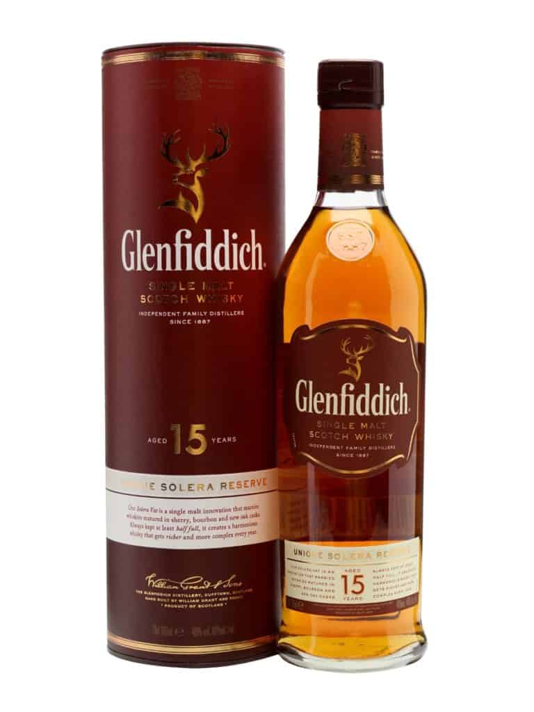
All the usual colours are there, the dark burgundy and the gold embellishment, but this time with a cream coloured label explaining the nature of their signature solera vat.
The bottle definitely has less writing on it, as is obvious at first glance. This makes it a lot easier to read and gives an easy-going impression.
Rather than layering on lines of information that not many customers are liable to read, Glenfiddich have taken a decidedly minimalist approach to their new designs.
The fresh designs are less overwhelming than the text heavy, black labels of old and Glenfiddich is definitely reiterating their design creds as well as their whisky creds here.
Both the labels on the bottles themselves as well as the triangular tuse that holds the bottle have had their word counts cut. We are still given a run down of the unique solera vat maturation system and the importance of its role in the crafting of Glenfiddich.
The burgundy of the label has also replaced the black, bringing the colours together in a more wholesome way. This brings the look of the whole bottle together and in my opinion, looks much neater and approachable than the labels of old.
Overall the new packaging definitely looks a lot lighter and less “busy”. Glenfiddich have improved the aesthetics of their brand while at the same time maintaining those iconic images that make them so recognisable.
Tags: 15-Year-OldburgundyCharlie Grant GordonGlenfiddichpackaging dissection

Greg
My name is Greg, and I’m a brand strategy consultant, writer, speaker, host and judge specialising in premium spirits. My mission is to experience, share and inspire with everything great about whisky, whiskey, gin, beer and fine dining through my writing, my brand building and my whisky tastings.
You might be interested in


More from the blog


Follow greatdrams
latest articles


Latest whisky
exclusively from GreatDrams