


Exploring the new Glenfiddich packaging design aesthetic
Greg|
let’s begin
As many of you will know, my background is in branding, specifically brand strategy and packaging design for whisky and other luxury spirits. Something has caught my attention recently within the whisky world; there is a radical new Glenfiddich packaging design aesthetic, and it is gorgeous.
Already one of the icons of the world of whisky and the most awarded Scotch single malt, Glenfiddich is a whisky powerhouse.
So why do they need to update their packaging design, and what does it mean for the brand?
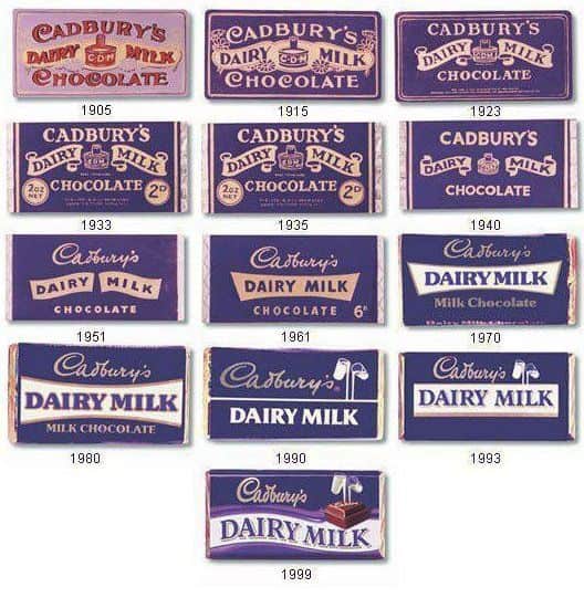
Brands very rarely retain the same packaging look and feel for more than a couple of years without even minor tweaks, even that chocolate bar you have been buying every week since you were young has been subtly updating to stay relevant and to keep looking fresh.
In the whisky world, with increasing demand for brands to resonate with younger Millennial consumers, brand are having to update their design aesthetic to be seen as fresh, engaged and energised, and that’s exactly what has happened with the new Glenfiddich packaging design.
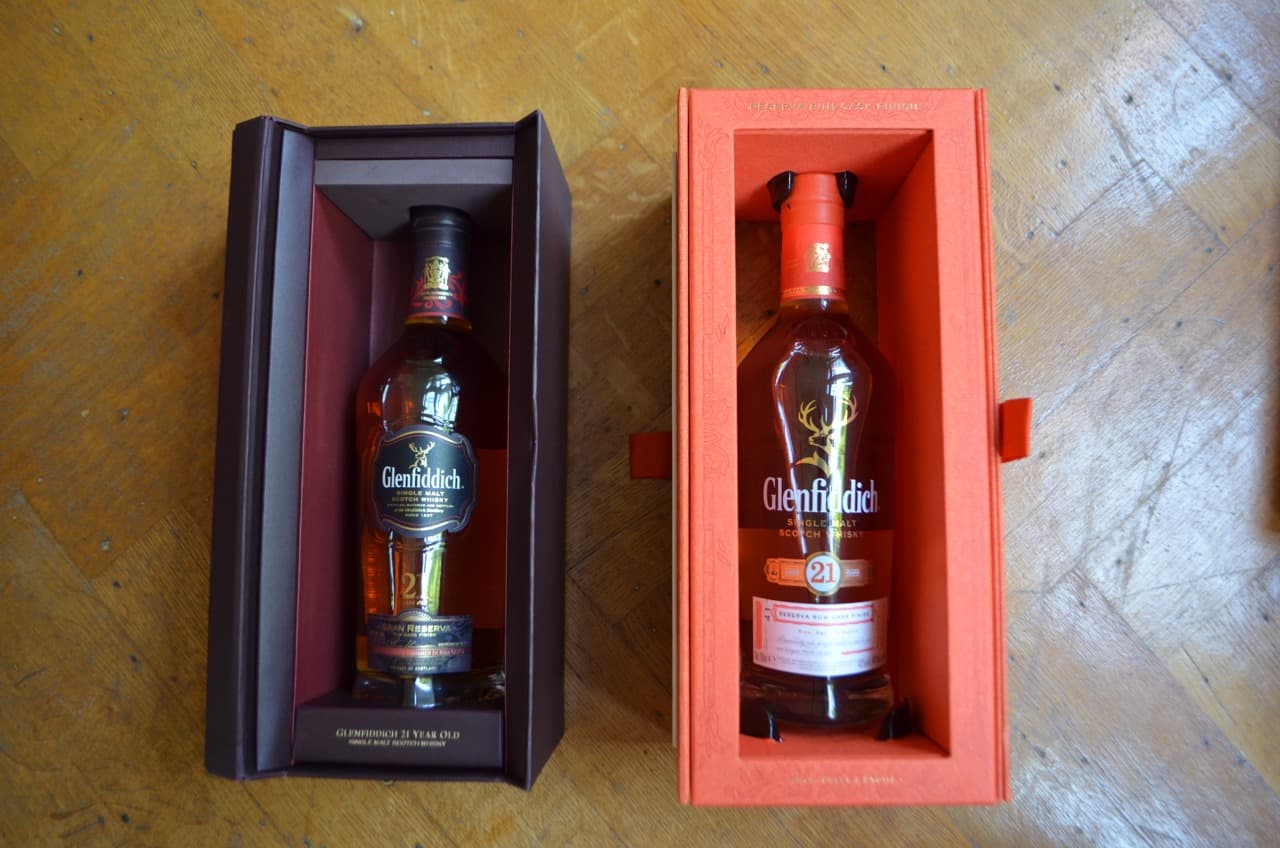
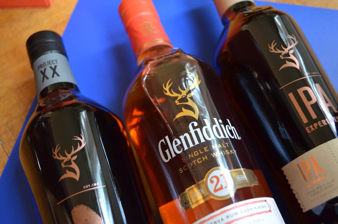
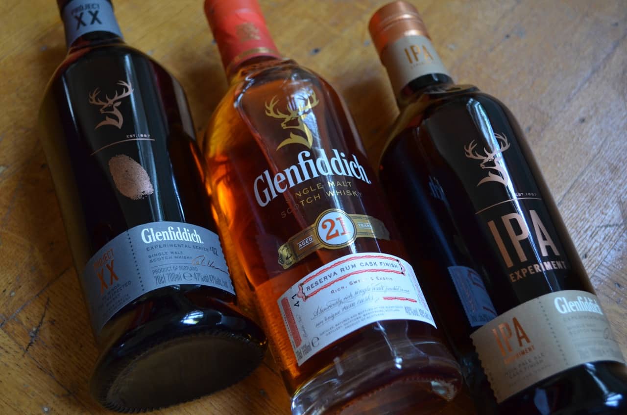
Now, when I say the new Glenfiddich packaging design, I do not mean that every single page of theirs has been updated, more that their exotic Glenfiddich 21 Year Old has been updated, and two new products have been released with a radical new look.
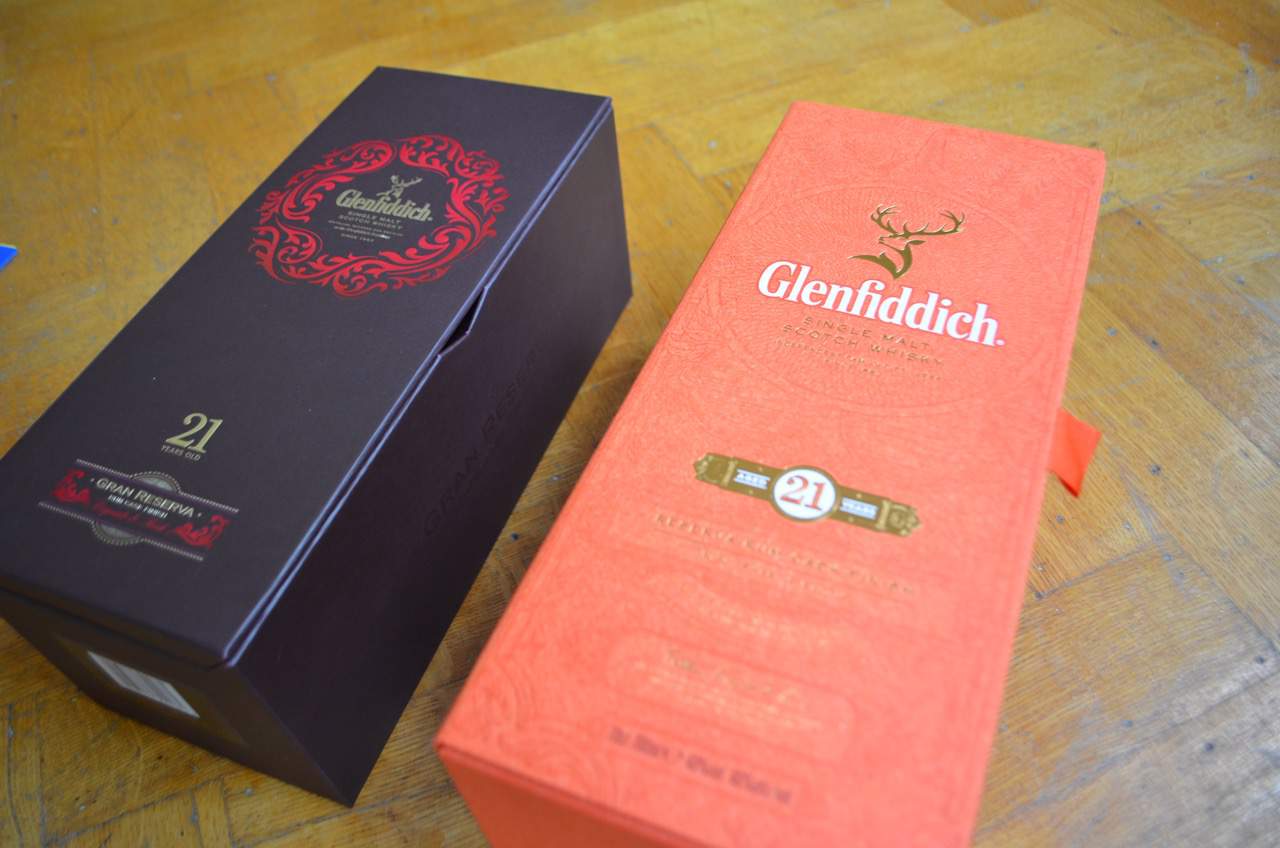
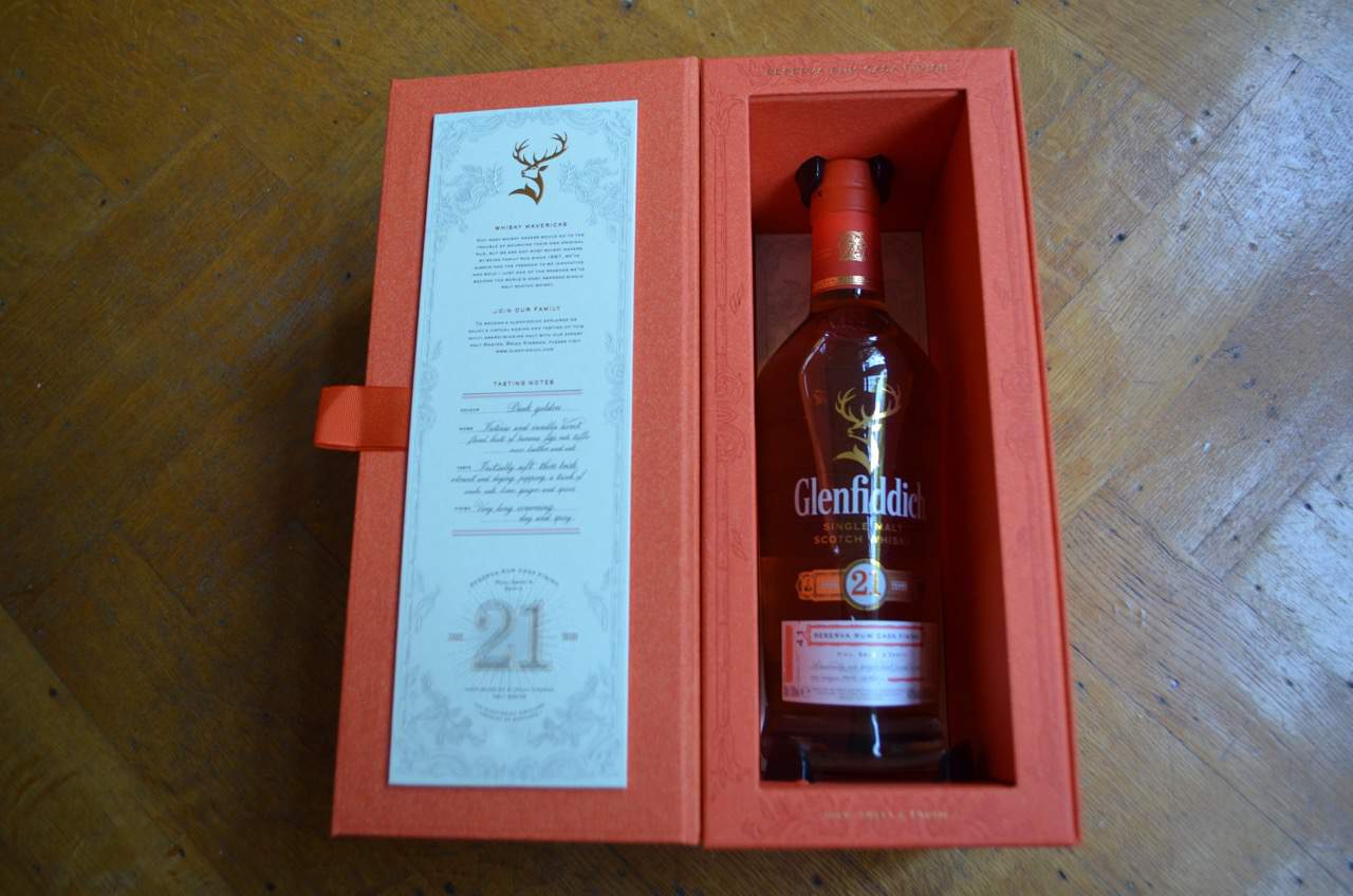
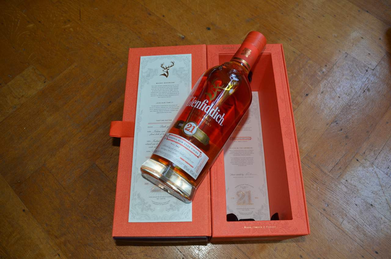
First, the Glenfiddich 21 Year Old.
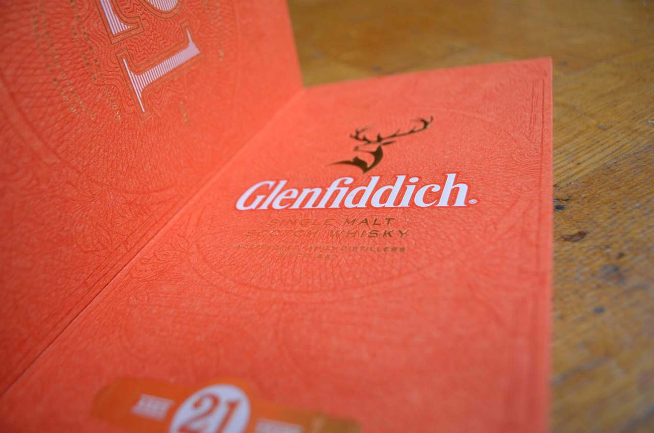
It is clearly a lot bolder than its predecessor, pictured below, with the brand, particularly the stag, a lot more prominent then before. The new vibrant orange outer box, complete with patterned detailing for a much more tactile experience when holding the pack.
When you pick up the box you instantly get a feeling of premium, well crafted and very well finished detailing; which is the exact product intrinsics of the Glenfiddich 21 Year Old liquid itself.
A gentle pull on each of the two, yes two fabric tabs opens up the pack to create a neat way to display your new purchase by heroing the bottle, and of course, the liquid. This also reveals side panels that go into a lot more of the story with notes from Brian Kinsman.
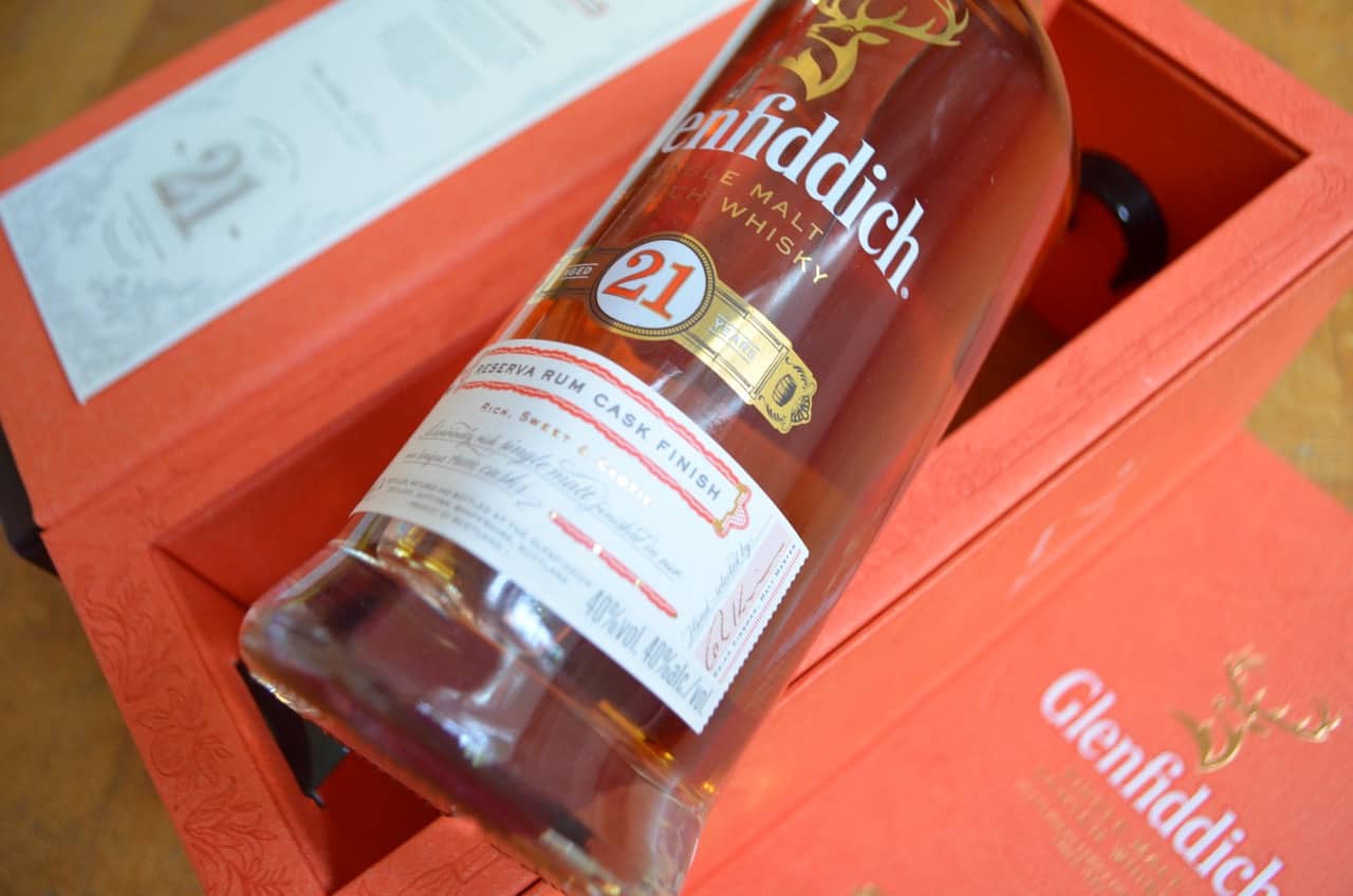
The bottle makes clear the Caribbean influence of the liquid, giving the whisky colour space to lure you in and make you want to explore this great value 21 Year Old Glenfiddich.
This is one of my favourite examples of whisky packaging this year, especially as it takes a previously dark pack with a premium feel and gives it true shelf standout that works equally well as a gift, or as a treat for yourself.
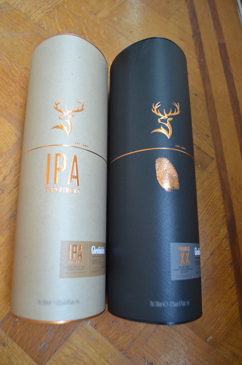
Then we have something quite remarkable.
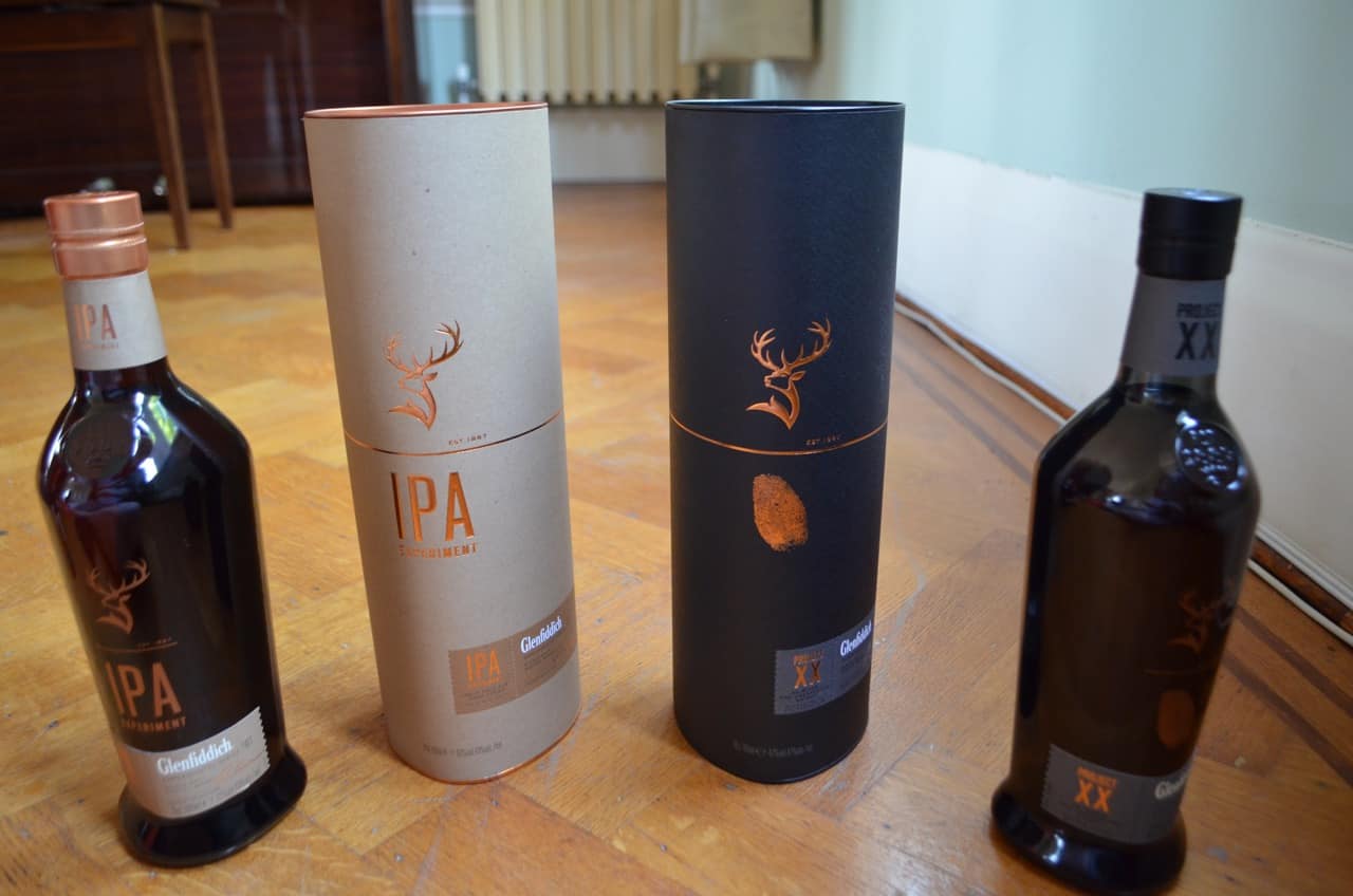
Released at the beginning of September as part of the Glenfiddich Experimental Series, Glenfiddich IPA and Glenfiddich Project XX have heralded a new, and distinctive look and feel for the brand.
From what I can recall, this is the first time that the iconic Glenfiddich Stag has been decoupled from the Glenfiddich word mark (logo) to really simplify the bottle design, showing the immense confidence the brand has in the recognisability of their Stag icon.
The results are striking; the gold cuts through both on the light and the dark outer packaging, with the bottles themselves looking sharp, uniform and incredibly slick.
Given that these products retail at £45 and £50 respectively, they both look a lot more high end than their price point would suggest; a great example of beautiful design at the end of the market still well within double digit price bands.
All in all I really love what Glenfiddich are doing with their brand, especially the Glenfiddich packaging at the minute and look forward to seeing how these products are received in the coming weeks and months.
Tags: aestheticbrand strategyGlenfiddichGlenfiddich packaging design aestheticpackaging design

Greg
My name is Greg, and I’m a brand strategy consultant, writer, speaker, host and judge specialising in premium spirits. My mission is to experience, share and inspire with everything great about whisky, whiskey, gin, beer and fine dining through my writing, my brand building and my whisky tastings.
You might be interested in


More from the blog


Follow greatdrams
latest articles


Latest whisky
exclusively from GreatDrams


4 thoughts on “Exploring the new Glenfiddich packaging design aesthetic”