Retail focus: The Whisky Shop
let’s begin
In theory whisky is becoming more accessible, that’s no secret, but in practice retailers have been way too slow to react to this newly empowered consumer. That is, until now and until The Whisky Shop.
Now, at this point I should clarify that The Whisky Shop has been open for a few months now, Piccadilly launched in December 2012 and Manchester August 2013, with gpstudio being appointed to design the space but it feels poignant to feature just how far these retail environments have gone to rejuvenate a market previously held sacred for older consumers, catered for with a couple of shelfs or a wall in a stuffy emporium.
The Whisky Shop dispels all the established norms of whisky retailing
Their retail design consultancy of choice, gpstudio, were briefed to create a revolutionary space that delivered on two key details:
Educating the consumer
Conveying a sense of the skill and craftsmanship involved in the creation of this fascinating luxury product(Off License News, October 2013)
The way gpstudio undertook this brief followed some classic retail design conventions around ‘zoning’. This is where different elements of the store are designated to different functions – you will notice it more in department stores and sports stores where it is clear what ‘world’ you are in by a change in design aesthetic and sometimes a different tone of voice that reassures you that you are in the right part of the store.
At The Whisky Shop there are three defined zones: “Show me”, “Tell me” and “Sell me” that help buyers navigate the store whether they are a whisky connoisseur or they are a first time whisky buyer.
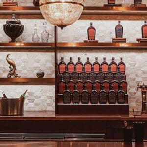
As you enter the store you will notice that there is a lot of light, something I was not expecting whatsoever.
It frames each bottle both individually and as a collective to show off the different brands and the different regions the whiskies hail from.
There is a real sense of awe associated with these stores, they remind you that years, often decades of blood, sweat, tear and craft has gone into the creation of every single drop of liquid consumers are about to enjoy.
That being said, it is also important to note that each and every product is treated as a hero in its own right. There are feature areas for specific brands such as Chivas but in reality they all play a part and, with ingenious use of light, they all symbolise something special.
Something that is also evident here that the products cannot do the hard work on their own, the staff are incredible at facilitating customer journeys, seemingly always ending up in the right place for the customer. For the record, I simulated several shopper mindsets across both sites with different staff in order to understand the experience fully.
iPads, etchings and brand stories bring the space alive further but arguably what made me smile the most were the lightbulbs.
Before you think I’ve gone mad, take a look. They look like crystal cut Glencairn glasses, a nice touch and a clear indication of both The Whisky Shop and gpstudio’s commitment to ensuring every touchpoint forms part of the story, no matter how seemingly irrelevant it may seem.


